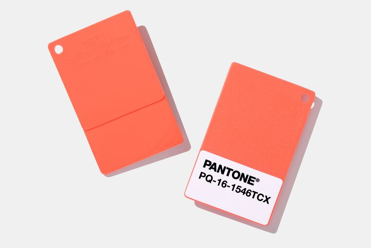
Pantone’s 2019 Color of the Year is Living Coral. It’s pretty, but does it speak to me? | Elizabeth Wellington
The 2018 color was Ultra Violet, better known as Prince Purple, the 2017 color was Greenery Green. What is the 2019 Color of the year and what will it say about the world?

The 2019 Pantone Color of the Year is Living Coral.
My gut reaction? Geez, not another freakin' summer, all-is-well-with-the-world hue.
Look at the New Jersey-based color authority’s most recent picks: the 2018 color was Prince-inspired pale purple, officially called Ultra Violet; 2017′s color was Greenery, a cross between a grassy and minty.
The 2016 Pantone color made COY history in the choice of two hues: Serenity — or sky blue — and Rose Quartz — think blush or millennial pink — as a nod to the transgender community.
So seriously, do we really need yet another juicy pastel? Living Coral is a deep pink with a generous splash of orange. It’s bright. It’s vibrant. It’s the life of the party. And in all honesty, after the year we’ve had — all of the unnecessary shootings, the natural disasters, and political animosity — I would have preferred a no-nonsense navy or a cloudy gray.
Not so, says Leatrice Eiseman, executive director of the Pantone Color Institute. Part of the reason Pantone put its stamp on Living Coral is to reverse our collective funkiness.
“We are living in a time when we need a nurturing color,” Eiseman said. “Living Coral is a color that sustains us and at the same time reminds us of the beauty of nature. … We have acknowledged the craziness in the world. We know that it’s there. But we wanted to pick something that was a positive force.”
This year, Pantone is celebrating its 20th year as the premier color of the year picker. Over the last two decades, fashion insiders have gleefully looked forward to the COY because it foreshadows the coming year’s hot hues in home decor, fashion, beauty, and automobile trends.
But it also serves as an indicator of our collective aura and mood, and I dug Pantone’s motives: I got the creative, intuitive vibe of Ultra Violet and the desire to return to nature inherent in Greenery. This year, however, Pantone is getting a little ahead of itself. Instead of reflecting our mood back at us, it seems as if this year’s color is trying to point me in the right direction.
“This year we were again inspired by nature," Eiseman explained. "Living Coral is the vibrant color in gorgeous sunsets, and most importantly it’s found in our beautiful coral reefs.” She paused, adding: “And we want people to be reminded of the bleaching of the coral reefs, too.”
Scientists say global warming is behind the vast fluctuation of ocean temperatures, threatening coral reefs and posing serious negative impacts on the world’s underwater ecosystem.
“This color reminds us of the beauty in nature and the fact that we want to preserve that beauty,” Eiseman said.
So Living Coral can perhaps be construed as a fashionable warning of sorts.
That, I can dig.
Regardless of how we are feeling, there is no dearth of Living Coral — or any of its orange, pink, or yellow variations — in the world of fashion and style. For the last few springs, makeup artists have painted eyelids coral to pop and brushed it on cheeks for a warm blush. Hairstylists have blended coral strands into auburn and blond tresses for unexpected punch. “It was a part of our springtime wave look,” said Monique Mason, owner of MOKO Organic Beauty Studio in Old City.
Bursts of coral light up tie-dye that is as equally popular in the street wear as it is with the art-as-fashion crew. And speaking of art, the Sofitel hosted a reception Tuesday for the Philadelphia-born artist Alfred Ortega, whose impressionist oil paintings feature many a coral splash. The Pennsylvania Academy of Fine Arts’ Rina Banerjee show, which runs through next March, features a host of the artist’s large-scale sculptures and installations with more than a few dollops of coral, including a large pink house-like sculpture with coral topped roofs. A photo of that sculpture, Take me, take me, take me … to the Palace of love, is featured on banners hanging throughout the city advertising the show.
In the home-decor landscape, coral is the color of comfy couches and accent walls. Like purple and blue, it gives off a sense of calmness but blush touch conveys warmth.
Just check out the lobby of University City’s new upscale restaurant, Louie Louie.
“We picked coral because we found when designing Louie Louie there was a lot of coral in both the art nouveau style period and Peter Max’s art work from the 1970s,” Sydney Grims, director of business development at Louie Louie’s parent company, Fearless Restaurants, wrote in an email.
“Coral conveys a feeling of calm and warmth, especially in our lobby and entryway floor mosaic.”
And it’s the color of sweet rose. Need I say more?
Fashionably speaking, Eiseman said, coral looks great on all skin tones. And it can take on a host of personalities: it can be preppy when paired with aqua, tropical when matched with green, funky in a very mod sort of way when paired with burgundy. Add some metallics and you are ready for a night on the town.
“Wear it with anything that’s monochromatic,” Eiseman said. “With coral, there is an element of surprise, and that is never a bad thing.”