A lesson in combining style and public spirit in a Philadelphia high-rise
Is The Bridge in Old City the best new residential tower in Philadelphia?
It's never easy doing developer architecture, but it's especially tough in Philadelphia. Construction costs are high, rents are meh, and tenants seem to care more about counter tops than cantilevers. Despite the city's long and lucrative residential building boom, even marquee projects, like high-rise apartments, have been dumbed down, wallpapered in metal panels, or shrink-wrapped in glass. The kind of details that are the soul of architecture, that give building surfaces texture and shadow, that keep us coming back for second and third looks, are hard to find.
The Bridge, which is nearing completion at Second and Race Streets in Old City, is the first of the recent crop of high-rise apartments to beat the odds. The $65 million design exudes something rarely seen in Philadelphia: a bit of design swagger. Its four-story podium shimmies down Race Street. The tower twists and shouts before kicking up its heels at the corner of Second Street. This building has rhythm.
For all the moaning about the high price of construction here, it didn't take much more than imagination to elevate the Bridge's design quality. Like its contemporaries, the 17-story tower wears a cloak of metal and glass, but its New York architects, Gluck+, have pinched and prodded those materials into something that feels almost sculptural. Ultimately, the success of the Bridge is the result of a series of smart choices, from the handsome gray color of its facade to the way its various components are arrayed on the tight, 20,000-square-foot site.
The location must rank as one of the most unlikely spots in Center City for a high-end apartment building. Not only does it sit hard by the clattering Ben Franklin Bridge, with its endless stream of traffic, but it occupies the final lap of what has unfortunately become the Race Street speedway, leading to the I-95 entrance ramp. Even if the Bridge is not to your taste, you have to give the developers — Jeffrey M. Brown, Greg Hill, and Kim Frank — and their architects props for civilizing this harsh corner and reeling the intersection back into the Old City neighborhood.
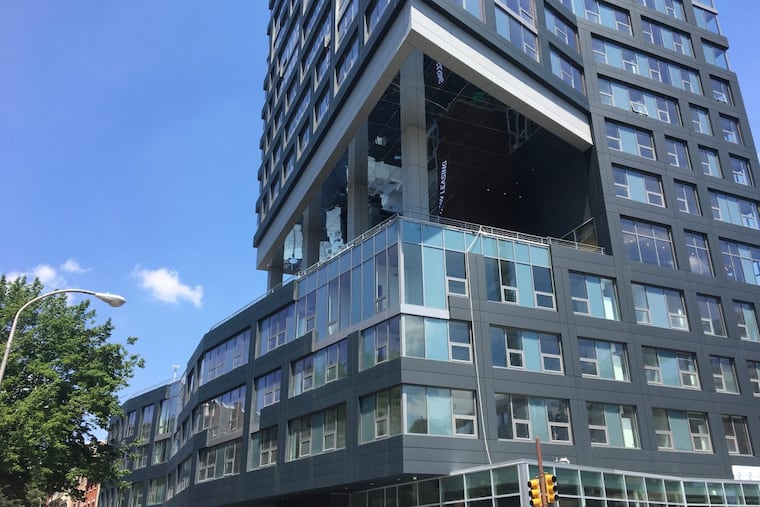
Most high-rise towers try to seduce you from afar with their aerial exploits. The flat-topped Bridge saves its best stuff for pedestrians. In deference to the scale of Old City's Colonial-era homes and 19th-century mercantile buildings, architect Peter Gluck set the tower at the eastern end of a long, four-story base that is roughly the height of the neighboring structures.
Because Race Street's traffic is so off-putting, the design team decided to enlarge the sidewalk buffer between the building and the road. That is usually done by setting the structure back behind an entry plaza. But in this location, a continuous open space would have disrupted the very thing that unifies Old City's three centuries of architecture: its consistent street wall.
So instead, Gluck kept the 50-foot-high base lined up with its neighbors but indented the facade at strategic points to form triangular pockets of refuge. The wall zigzags along the sidewalk, folding inward for a restaurant (Tuna Bar), a cafe (United by Blue), and the Bridge's main entrance. The sidewalk is just 24 feet at its widest, yet it's easy to imagine sitting at a cafe table there, enjoying a drink. Benches and plantings along the curb will further help insulate patrons from the traffic. Though the architecture is contemporary, the folded facade is a trick borrowed straight from baroque Rome and buildings like Borromini's Propaganda Fide.
In a sense, there are two bases. Three stories of metal-clad apartments rest on a glassy retail structure. The indentations alternate, so that the residential portion shades the retail seating areas. The undulating sequence continues around to Second Street.
Keeping the base in scale with the neighborhood was important because the Bridge's overall height — 186 feet — makes it substantially taller than most Old City buildings. The project was bitterly opposed by the neighborhood association when it was first presented — in 2004! — as a 10-story condo building. After the project was resurrected in 2013 as a rental tower, and the height was increased, the owner of the adjacent billboard mounted a legal challenge to keep the tower from blocking views of its sign from the Ben Franklin Bridge.
The design team was able to appease the billboard owner, Keystone Outdoor Advertising, by pivoting the tower slightly to maintain the sightlines. In the process, they pinched in the Bridge's east and west walls, establishing an intriguing geometry that gives the tower a sense of movement.
The 12-story shaft is set back from the edge of the podium, forming a shaded outdoor seating area for residents. A mirrored ceiling on the canopy reflects the street life below and produces an odd optical illusion. From many vantages, the tower's southeast corner appears to levitate upward.
Adding to the array of effects is the metal grid that clads the tower. Like Philadelphia's own street grid, the pattern stops and starts abruptly. It eventually peters out near the top of the tower. Although the building doesn't dissolve into the sky in quite way the renderings had suggested, the broken grid sets up an interesting contrast between the flat and raised surfaces. The windows, which are arranged in clusters of one to five, are set deep into metal frames, so that they read like the "punched" windows we're used to seeing on traditional masonry structures. All that gives the facade more dimension and relief than a typical metal-panel building.
It's interesting to contrast the project with One Water Street, a block east on the Delaware waterfront. The Bridge's dark grays help it blend in with the suspension bridge, whereas One Water's blinding white causes it to stand out. The Bridge's use of metal panels is also substantially more dynamic. But more important, the Bridge is a model of how a commercial development can also be a good public citizen.
Like One Water, it took advantage of the city's height bonus for incorporating affordable housing. One Water Street reneged on the deal, but the Bridge stuck to its promise, and there are now 15 units rented at half the market rate, roughly $850 for a one-bedroom, out of a total of 146 apartments. (After a public outcry, One Water's owner agreed to compensate the city by paying $3.75 million into an affordable-housing trust fund.) The Bridge included just 24 residential parking spaces but offers 100 bike racks and four car-share spaces.
The Bridge also made good on its promise to make the retail and public space a meaningful part of the ground floor. Even though One Water Street received a second height bonus for providing public space, you'd be hard pressed to find it. It's the long concrete bench on Columbus Boulevard.
It's really no mystery how the Bridge ended up as one of the best new apartment buildings in the city. Its developers and architects simply tried harder.