The building that Ed Bacon thought was too ugly for Society Hill | Inga Saffron
Once the subject of fierce architectural debates, the Old Pine Community Center now sits with ease among its colonial neighbors.

Even though Denise Scott Brown and the late Robert Venturi are often credited with (perhaps accused of would be better words) giving birth to postmodernism, they always hated being called postmodernists. They insisted that their designs are really hybrids because they mix modernist tropes like ribbon windows, with more vernacular elements like square storefront windows. Venturi’s preference for such “impure” designs forms the crux of “Complexity and Contradiction,” his 1966 architectural manifesto.
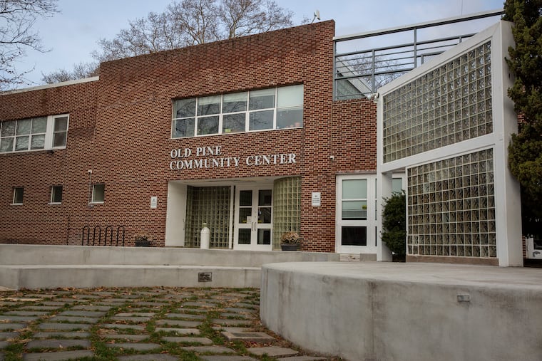
While architects around the world took the book’s message to heart, it wasn’t always easy to convince Philadelphians to accept Venturi, Scott Brown’s designs. But a decade after the book appeared, a very Venturi-like hybrid by another architecture firm managed to sneak into that most traditionalist of neighborhoods, Society Hill. Designed by Friday Architects, the Old Pine Community Center incorporates Georgian, modern, Victorian, and vernacular elements. The result is what Venturi might have described, in a positive sense, as a rather “ordinary” building.
Of course, back in 1976, not everyone in Society Hill liked his idea of ordinary. City Planner Edmund Bacon was appalled by Friday’s style mash-up and denounced the design as “ugly” when it was presented to the Redevelopment Authority’s Design Review committee. Others worried that the community center’s deep setback from the corner of Fourth and Lombard was un-Philadelphian, anti-urbanist, and a violation of the street grid. After an intense and ideological debate, Friday’s design was finally approved. It ended up being praised in Progressive Architecture magazine, the bible of modern design.
From today’s vantage, it’s not altogether clear what the fuss was about. Faced in red brick, the long, two-story building is a modest, unassuming structure. Yes, it’s clearly a modern building. But in those days, all infill buildings in Society Hill were expected to be designed in a modern style to differentiate them from the colonial-era survivors.
What seems to have set off the critics was Friday’s postmodernist stew of styles. The Lombard Street facade follows the Venturi script by mixing ribbon and storefront windows. Around the back, Friday attached two bays — one enormous, the other standard size — overlooking Old Pine Church’s colonial graveyard. While the brick is red with black accents, the arrangement is the inverse of the typical Colonial pattern. Inside, Friday borrowed from the Victorians by tiling the floor to mimic Middle Eastern carpets.
None of these design choices was arbitrary, says Don Matzkin, who was one of Friday’s founders. The late David Slovic, who was the lead designer, selected the different window types to reflect what was going on inside the community center. The ribbon of windows on the second floor brings a continuous stream of natural light into the gym, while the large bay window offers expansive views of the historic church and cemetery.
There is much more to this design, however, than architectural subterfuge. In an effort to repopulate Society Hill, which was a national showcase for a gentler version of urban renewal, the city offered the 400 block of Lombard to the Old Pine Presbyterian Church. After completing the Presbyterian Historical Society at the Fifth Street end of the block, the church decided to use the remaining land for a nondenominational community center. Friday was chosen as the architect after coming up with a brilliant, low-cost plan to extend the historical society’s archive underneath the community center’s grassy front lawn.
While you certainly wouldn’t want to see other Philadelphia buildings imitate the deep, 50-foot setback, Friday gets credit for turning the extra frontage into a welcoming community space. The Fourth Street corner features a small amphitheater that doubles as an entrance plaza and sitting area. An angled, glass-block wall gives a sense of enclosure and directs visitors the center’s front door. To the west, the open lawn provides a place for kids to run around.
With memories of the fierce architectural debates now fading, the building is mainly known as a community hub. Old Pine offers a variety of children’s activities, including day care, after-school classes, and summer camp, along with an extensive homeless outreach program. The exclusive St. Peter’s School uses the gym for sports, while Old Pine’s intramural basketball program draws from neighborhoods around Philadelphia.
Not a bad outcome for a building once deemed too ugly for Society Hill.