SEPTA proposes renaming its city rail lines to help everyone get around
Only longtime users can decipher the century-old labels to navigate the system. SEPTA thinks colors and simpler signs could help.

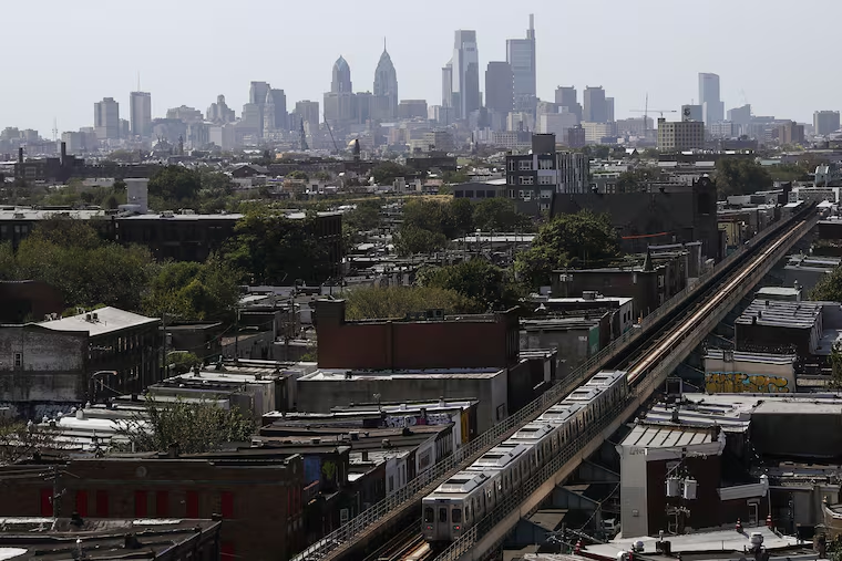
SEPTA’s rail transit network makes for a sprawling map, and it’s a mouthful to say (take a deep breath): the Market-Frankford Line, the Broad Street Line, the Norristown High Speed Line, and the 10, 11, 13, 15, 34, 36, 101 and 102 Trolleys.
Why not just call the whole Hydra-headed lot of it the Metro?
The SEPTA Metro.
That’s a big opening proposal in the transit agency’s wayfinding master plan, released Tuesday, to make rail transit easier to use in the Philadelphia region. The idea: Unify under one brand a system often thought of line by line, route by route because it’s been labeled that way for a century.
“We perceive all of these services to be so separate we’ve never really emphasized the power of the network that they constitute,” said Lex Powers, the manager of strategic planning at SEPTA, who is leading the project.
“The philosophical problem that we need to solve is defining what we’re talking about,” he said.
In conversation, people are more likely to identify themselves as a rider of their usual transit mode than as a SEPTA customer.
The agency plans a redo of the system’s maps and signs with the aim of making wayfinding images easier to see and understand quickly. Lines will be denoted by capital letters and color badges instead of pictographs of rail vehicles over colored backgrounds. Planners propose keeping the hues historically associated with them, such as orange for the Broad Street Line, blue for the Market-Frankford Line (the El), and green for trolley routes.
New York City uses letters and numbers with color badges on its metro trains, as do many other systems.
It is expected to cost $40 million through the 2023 fiscal year, which ends in June of that year, to design and implement a new wayfinding system.
The proposed changes come at a critical time as SEPTA tries to recover from the pandemic, during which a steep drop in ridership has cost the agency millions. It’s also trying to attract new customers and, in the longer term, accommodate people’s changing travel patterns beyond the usual 9-to-5.
“Unifying our transit network is tremendously important for improving accessibility and welcoming people back to the system in the COVID recovery,” said Jody Holton, SEPTA’s assistant general manager for planning.
Simpler logos and consistent, less cluttered signage also would help orient immigrants and visitors to the city with limited or no English proficiency, people with disabilities looking for accessible entrances and exits, and even long-term riders making an unfamiliar trip.
“Transit really needs to be the common denominator, the most accessible piece of our public space,” Powers said. “It needs to be for everyone.”
The icon for the new Metro brand would be the traditional SEPTA logo, in black and white so it can stand out amid the overall color scheme and be a beacon outside stations.
“Metro” is used around the world, Powers said, and it translates well into Spanish and Chinese, the second and third most spoken languages in the Philadelphia area.
SEPTA bus service is in its own redesign process, with any proposals to change nomenclature or graphics to come later.
Using fewer full English sentences and words is key to helping users make the right decisions faster, Powers said. The plan calls for signs to use Roboto, a clean typeface considered easy to read.
SEPTA now will seek reactions and suggestions from the public on the wayfinding plan, as well as share the findings of the research that has gone into drawing it up, including opinion surveys and meetings with transit advocates and community groups and organizations.
In collaboration with University of Pennsylvania researchers, SEPTA has conducted experiments to see how people process wayfinding signs in real time.
» READ MORE: Testing how navigable SEPTA is, with glasses that see what riders see
In the public-opinion survey, for instance, a majority of respondents said they look to signs and system maps in stations most for their travel cues. People also told the survey takers they had trouble identifying line and route icons when they weren’t associated with a color.
“There really isn’t anything in here that represents a gut feeling,” Powers said. “We can explain why we think something might be the best way to go, why something is [in] the proposal.”
Early reaction seemed mixed among the city’s active community of transit aficionados, at least on Twitter, with positive reviews running slightly ahead of negative ones. But, as Powers hinted, many people may need some persuading.