SEPTA launches new website it says will be faster and easier to use
SEPTA started from zero to redesign a website that was easier for riders to quickly read and find what they are looking for.

SEPTA is cleaning up its act.
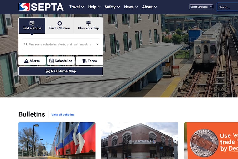
The agency switches fully to a new, simplified website Thursday morning that groups essential information so riders can find routes, schedules, alerts, fares and real-time information for trip planning with a few clicks instead of longer expeditions to separate pages or microsites.
It was designed and built over more than 18 months, relies on graphics — rather than lists of, say, routes or service alerts — and loads fast on mobile devices. SEPTA has been phasing in the beta version of the new site since August.
More broadly, the architecture of the new website provides a flexible platform to help “unify the SEPTA brand,” said Lex Powers, director of service information design, who also has been leading a modernization of the system’s wayfinding, the colors, signs, symbols and maps that help people navigate.
The platform also will allow for ongoing tweaks, so coming changes can be gradually introduced before they’re implemented on the ground, such as the branding of trolley, subway, elevated and Norristown light rail as a unified “Metro” service, with colors and one letter to denote each separate travel mode.
“The site, for example will allow us not far down the road to start using the L icon next to ‘Market-Frankford Line’ or the B icon next to ‘Broad Street Line’ but making sure that they’re always together so that there’s no opportunity for confusion,” Powers said. “It’s really going to be a slow, phased-in learning process so no one gets overwhelmed.”
The Metro scheme will be implemented later in 2024, he said. SEPTA also plans to introduce the complete redesign of its bus network next year, and clear communication of the changes to routes will also be critical, Powers said.
“We’re putting the information that’s important to riders at the forefront of our website,” said Sabrina Rynearson, director of digital communications for SEPTA.
They’ve also been listening. Feedback from users of the beta site helped shape the tight grouping of rider information on the home page, said Katie Monroe, who’s in charge of communicating SEPTA service alerts.
“Some of these tools were available in different formats, like on the old, separate real-time website,” Monroe said. “The value here is that all the information is integrated in one place on septa.org.”